I like to try out new things and see if they fit me. In January I started a new hobby: (modern) calligraphy. It has been a hype since 2016 or so, but I never paid much attention to it until now. I love creating things, and I love slow hobbies that make me experience time in a different way, so this could be right up my alley. I had been missing hand writing for a while, as I usually type or swype my writing nowadays. My hand is not used to writing anymore and I was sad to be losing a cherished skill. Time to do something about it!
On Instagram, you can find many accounts dedicated to pretty writing. There are challenges too, where you are asked to embellish a word or a sentence every day, often with a monthly theme. I decided to just create an account and join in. I had some Talens Ecoline brush pens and started practicing!
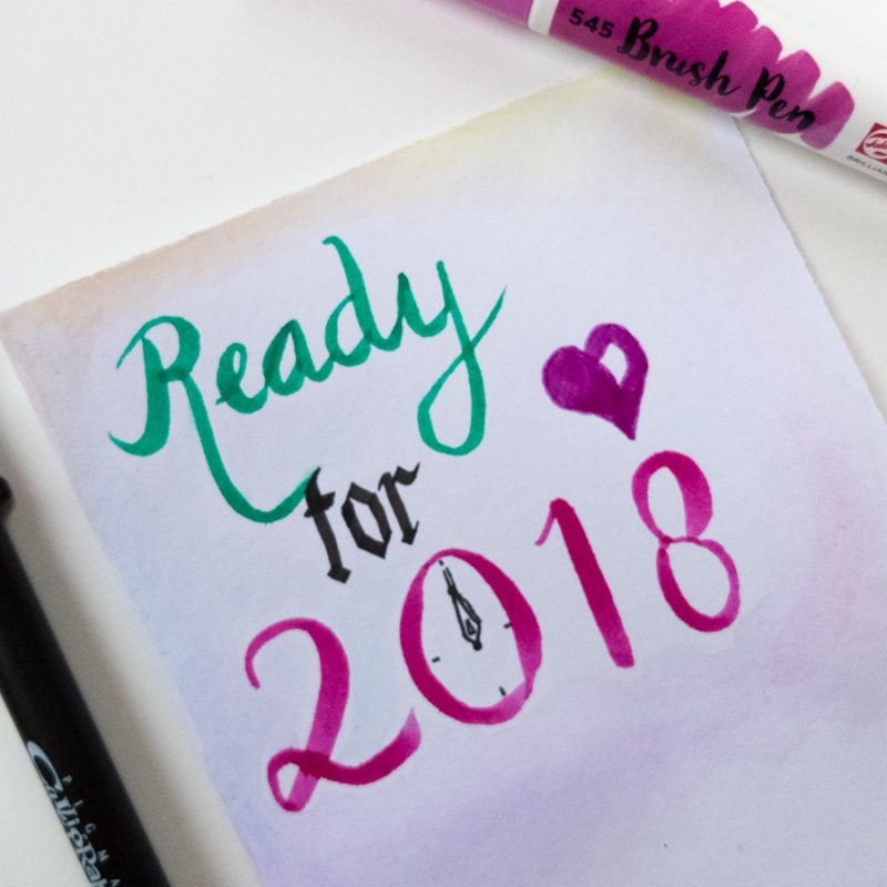
A long, long time ago, when I was about 10 years old, I had been doing some calligraphy with a calligraphy pen. I had a book that taught me how to write Gothic letters, and I did that for a while until I became bored. But other than that, I had no idea about calligraphy, let alone the modern version.
I noticed that most people used more or less the same font, often straight instead of slanted, and it was close to the hand writing that I learned when I was a kid. The big difference was that every downstroke was thick, and every upstroke was thin. And they added extra embellishments, called flourishes, or added small drawings to liven things up. Basically, everybody was just playing with words and colours and shapes and generally having fun.
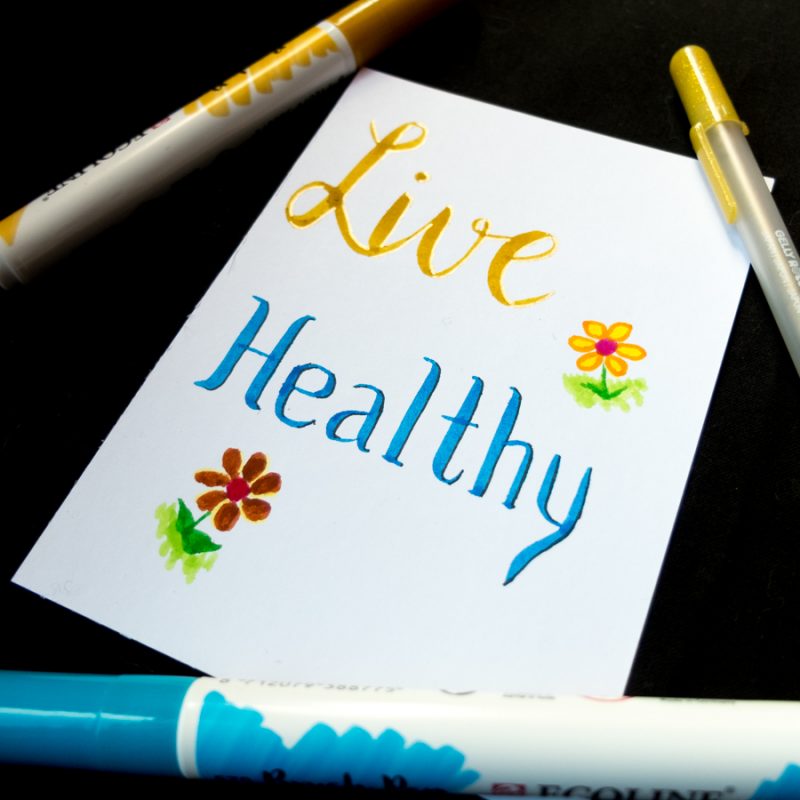
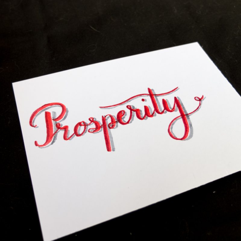
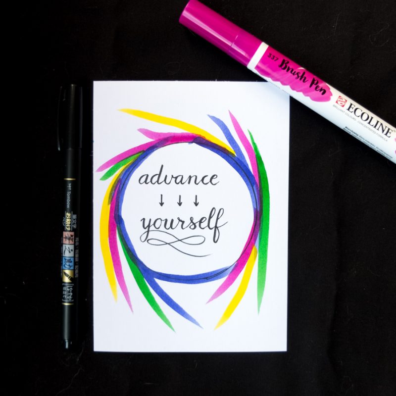
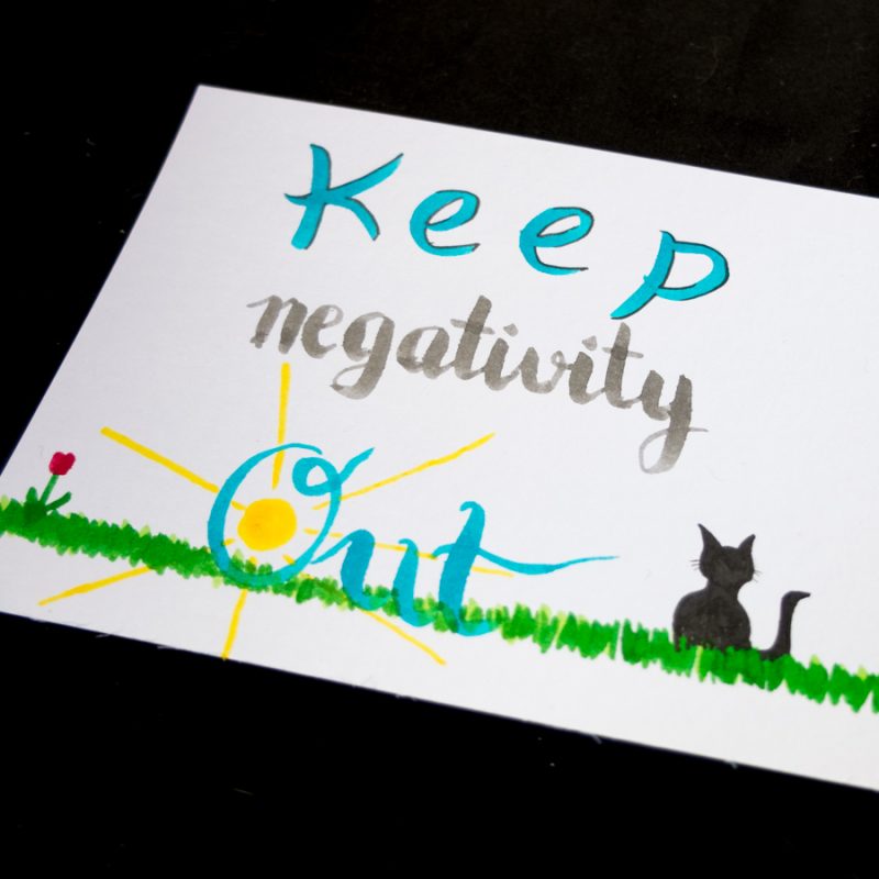
I was having tons of fun, and found out some other fun tricks. You can use a palette, colour a bit on it with one of your brushes, then pick that up with another brush to create gradients! And then I could pick up my waterbrush pen and paint with the ink from the palette as well!
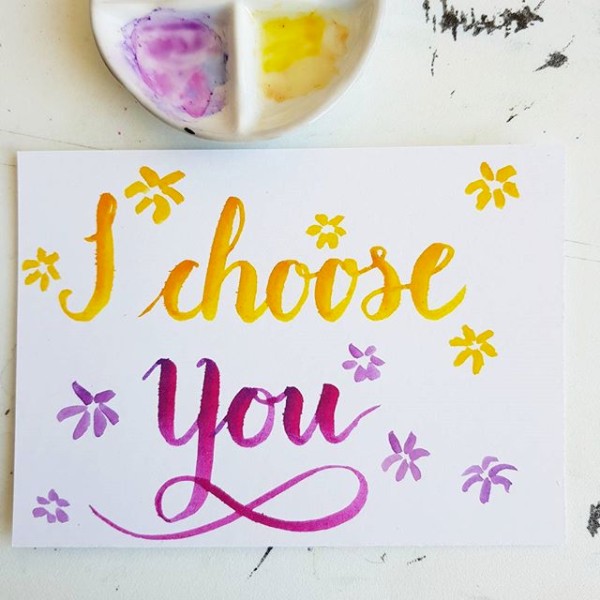
I fell in love with the Kuretake Fudenosuke soft brush pen:
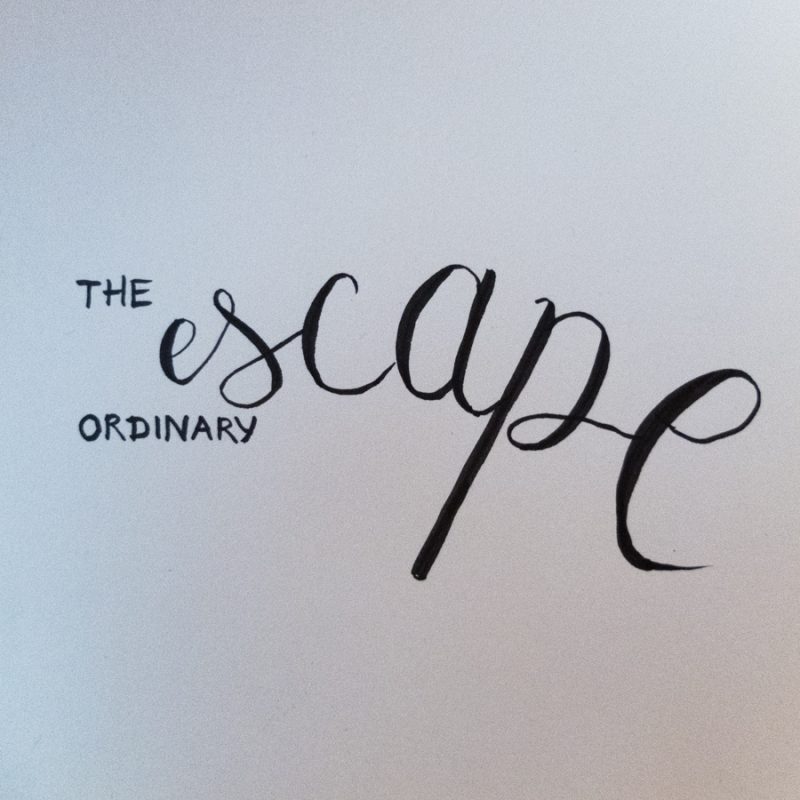
I added some origami to spice things up:
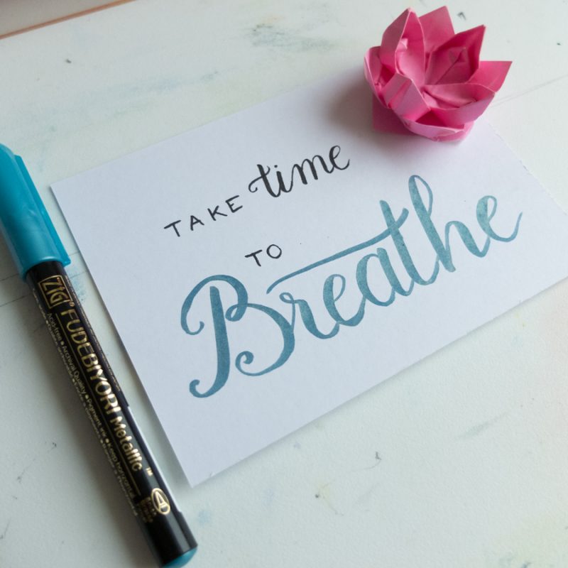
And then the January challenge was over. It was fun to do, and using the Kuretake brush pen inspired me to read a bit more about old-fashioned calligraphy with a dip pen. The pen I had used when I was little had a chisel-shaped tip, but I found out that there was also a type of dip pen nib that allowed you to create thick and thin lines by increasing or decreasing the pressure: the round nib. That sounded interesting! So I got myself a basic dip pen and, after reading a bit more about nib types, I ended up with a Nikko G nib and a Zebra G nib, which are moderately flexible round nibs, very suited for beginners. I also got an 101 Imperial nib which is a bit more flexible. And some black Kuretake ink.
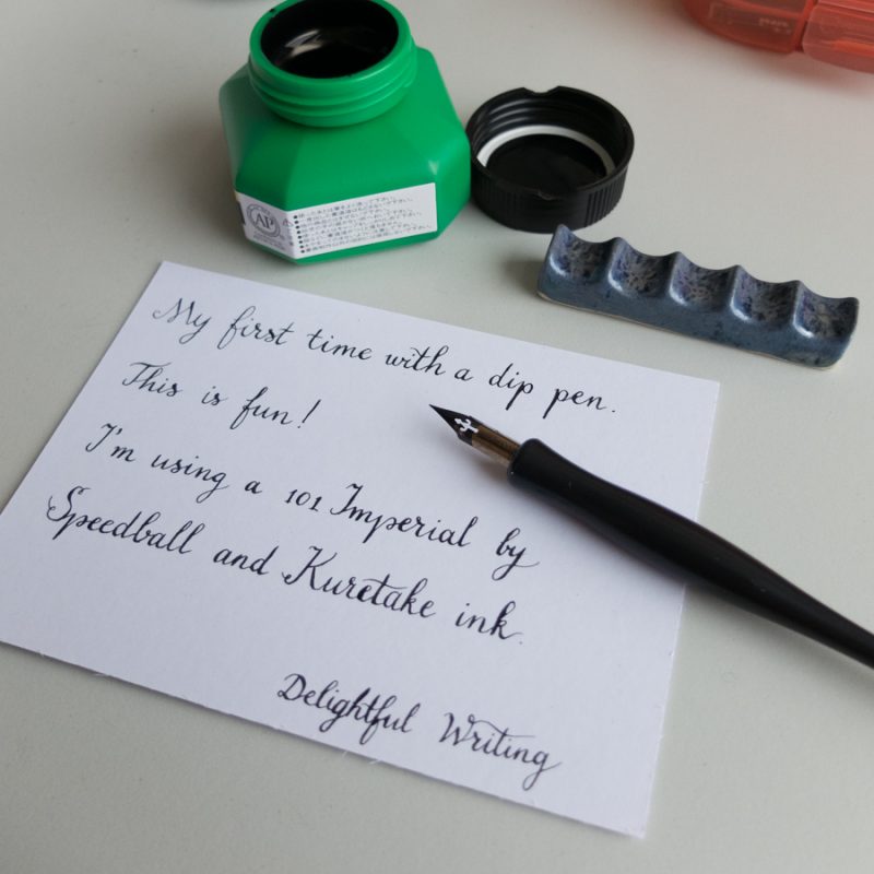
Notice that I’m just using my regular handwriting here, with a bit of embellishment on the t’s. I was quite happy that I didn’t end up with a big blob of ink on the paper, since I had never used a dip pen before.
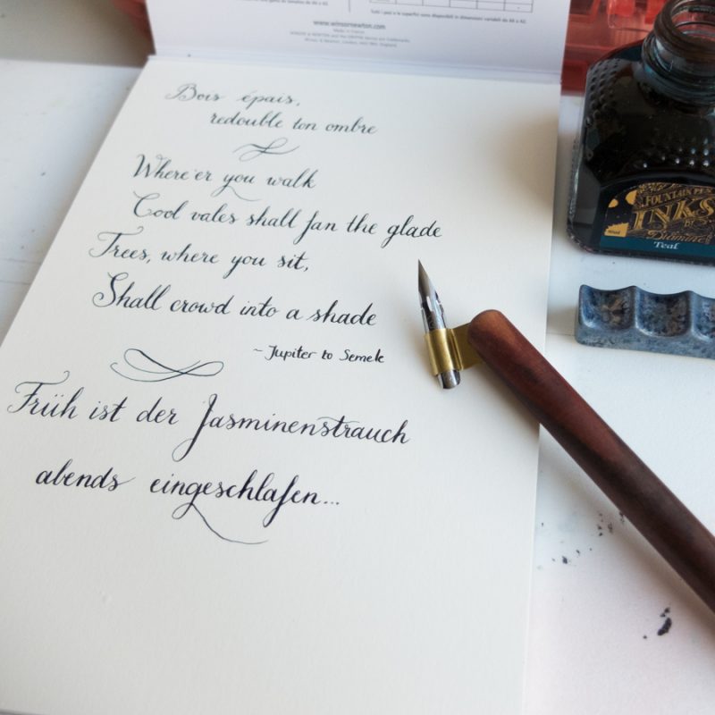
After lots of practice, I’m able to manage the thick & thin much better already, and I’m also a bit more consistent in angles and sizes of letters and words. I still struggle with flourishes, though. They don’t look as carefree as I would like. Need more practice, obviously. Notice that I’m using an oblique pen here to make it easier to write with a right-leaning slant.
I also added some more ink to my supplies. I’m using Diamine ink, which is quite good and relatively inexpensive, in a couple of different colours. Working with different colours makes writing more fun for me. I love to work with sepia-like colours, greens, and purples.
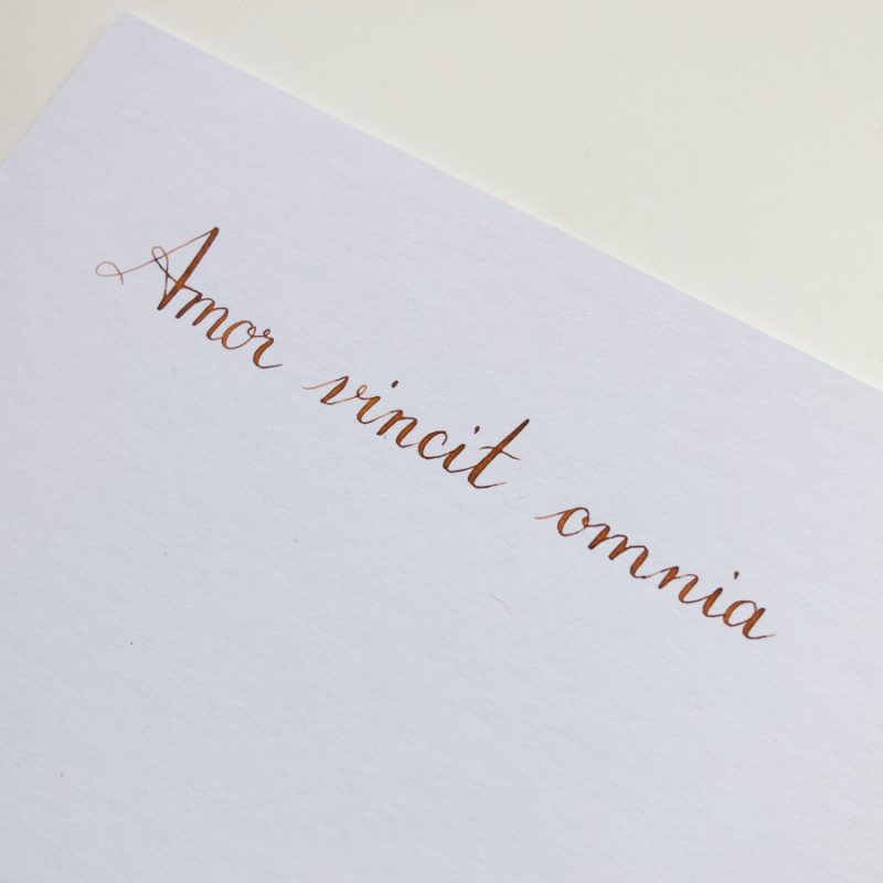
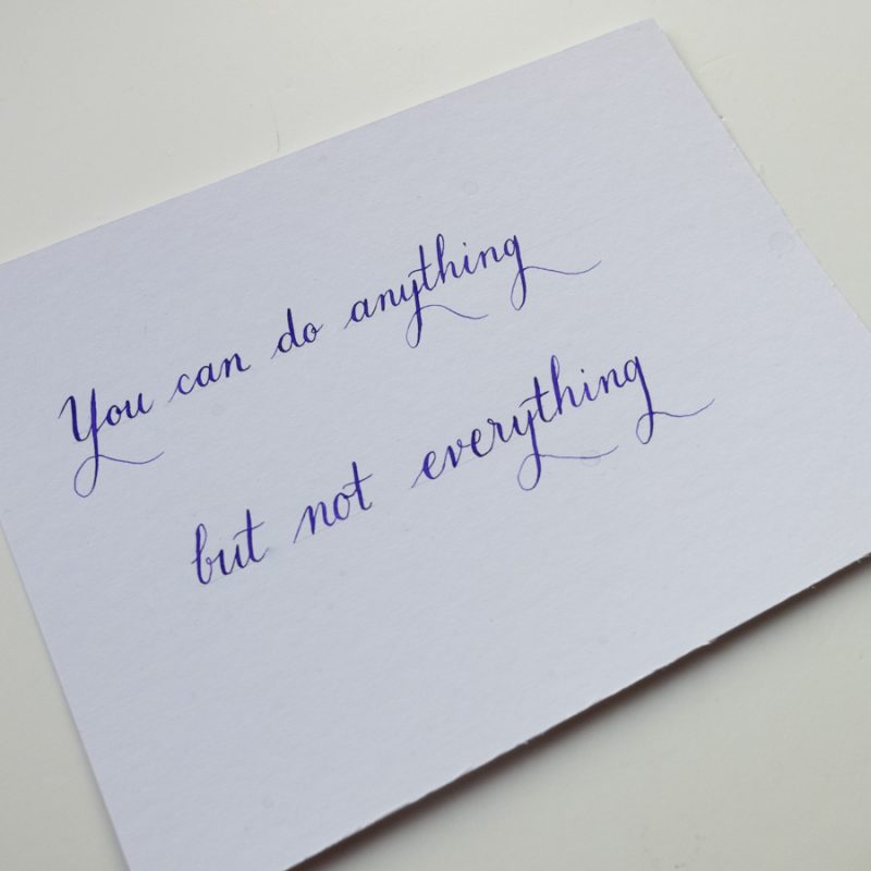
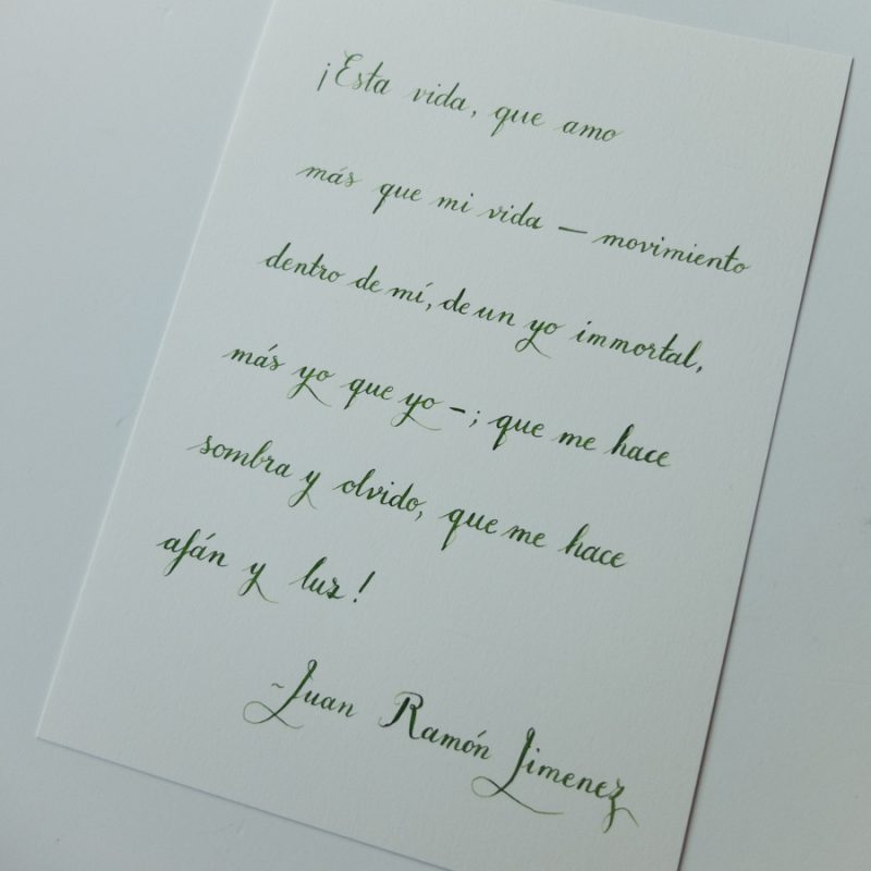
I’ve been practicing a Copperplate-like script lately, and I will also be diving into Uncial and Gothic again when I feel like it. I’d love to learn some new, creative capital shapes, and extend my flourishing abilities. I will certainly enjoy writing down inspiring and beautiful texts. I do still use my brush pens, but I like working with a dip pen even more.
