After yesterday’s struggle with painting trees, I decided to look around for tips and tricks to achieve what I want. I did not find exactly what I was looking for yet (painting foliage closer to you without painting every detail), but I did find some information about painting trees.
Some basic things to pay attention to are:
- A tree grows upward (doh!) and all branches want to move up. If they are heavy they will hang down a bit, but their ends/twigs still move up.
- A tree is basically a bundle of fibres, so don’t paint a straight trunk, and keep it textured. Add the branches from the trunk upwards, one by one, meanwhile filling up the trunk.
- Branches move to every side of the tree, also to the front and to the back.
- Create depth in the tree by adding shadow spots in the appropriate places. The light falls on the tree from a certain angle and the branches and foliage also shade the lower parts of the tree.
- Branches and twigs follow an erratic pattern, but in the end they move up. Make them more interesting by rotating your brush while painting.
- Leaves don’t stand on top of branches, they hang from them.
- For faraway trees you can suggest foliage by using a sponge and a couple of tints of green.
- Only paint small portions of detailed leaves (for example at a branch’s end) and suggest the rest.
I tried to follow these guidelines when attempting another tree today. It’s better than yesterday already!
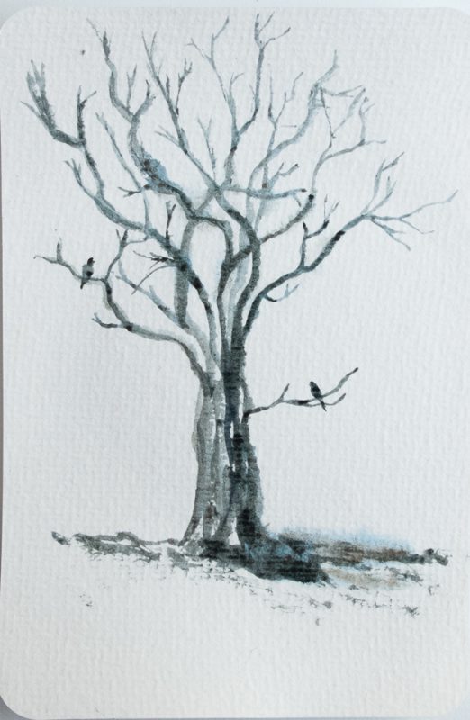
I mixed some blue and brown to create a nice greenish gray to sketch the basic shape of the tree with. I painted the branches from the base up to the sky. I tried to already pay attention to shadow parts (the light comes from the left). I kind of like this monochrome painting actually! I love all the different tints you can make with just this colour mix and water.
Then I started adding leaves. I worked from light to dark. I tried to keep in mind where the branches were going (which was in front of which) and I also paid attention to not filling in all the holes. The little birdies need some space to fly through, right?
I added more colours to the leaves, ending with some blue in the darkest shadows. Then I strengthened the parts of the branches that were not covered by leaves. I also put a bit of red on those branches and on the light side of the trunk.
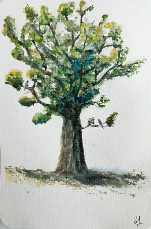
The tree still looks a bit wild, though not as bad as yesterday’s tree. I need to put in a bit more detail in the leaves at the top left, and darken some leaves at the back. But overall it looks like a decent tree now.
I especially like the trunk and the transition to the ground. And the suggestion of leaves in the branch on the right side. And the birds, of course!
