One subject that I really, really love, and always get back to through the years (and in my pastimes) is colour. It is essential to drawing and painting, but also to spinning and knitting, to photography, and, in a more abstract sense perhaps, to music and food. Colour has to do with feeling and emotion, but it is also a science in itself.
Now that I’m painting with watercolour paint, I regularly mix my own colours. This is relatively new for me, because with pastel painting you don’t do that often – you just get extra pastels in different colours (you can mix, but it’s not always pretty). When working with pastels I was more focused on the interaction of colours when placed next to each other than with creating new colours by mixing them. Even on my fibre blending board I would not create a uniform mixture of fibre colours, but a nice arrangement and mix of interesting colour combinations. As the size of the elements (fibres) was so much larger than ground pigment, it would never become an even colour anyway (which is perfectly alright and keeps it interesting).
So with watercolour I’m treading into unknown territory. How exciting!
A couple of years ago I had a colour type analysis done, and I have looked at colour from a different perspective since. No longer did I think of pastel colours as just being pale baby colours, no, they can be any colour, but with a bit of added grey to make them less vibrant. Colours that had an undertone of yellow were supposed to be warm, and colours without yellow were cool in the colour type analysis system. So far so good. But then I turned out to be a cool summer type, and there still was yellow in my colour palette – a very light and “cool” one, but still. Yellow contains yellow, right? There were also some green tints in there, which contain yellow too. So, cool is not really cool in that system, or my definition of cool was not correct. My theory now is that these palettes are made for humans, not for white sheets of paper, hence the warm bias even to “cool” palettes.
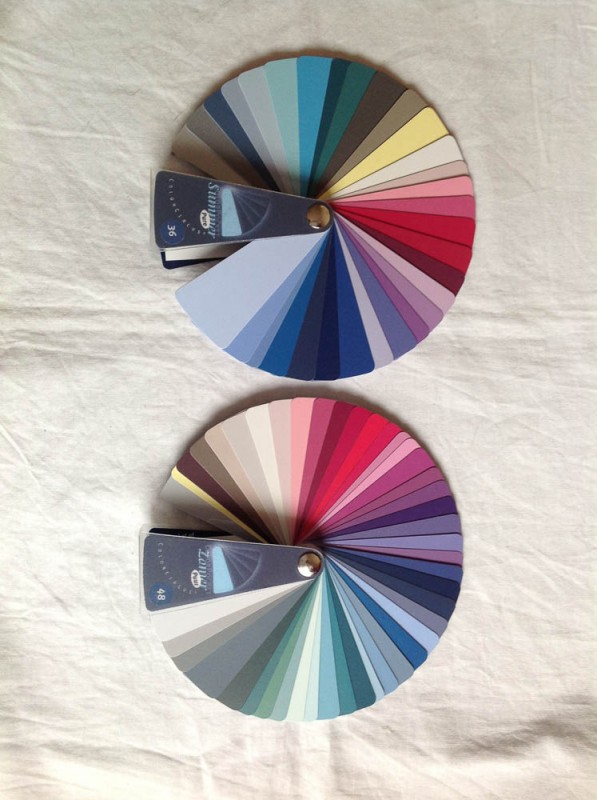
When looking at the colour wheel, the traditional interpretation is that red, orange, and yellow are warm colours (probably because they remind people of fire), and green, blue and purple are cool colours. You could argue that purple is warmer than blue because it’s closer to red in the colour wheel. Same goes for green, which is warmer than blue because it’s closer to yellow.

But when looking at the light spectrum you will see that it goes from red all the way to purple, and purple and red are actually on opposite ends of the spectrum, not next to each other like on the colour wheel.

That’s weird, right? What is warm, what is cool? Is purple actually cooler than blue?
It gets even more confusing when talking about pigments and paints. The pigments/paints that painters use are never a “pure” red, yellow, or blue (or cyan, magenta, and yellow). They have a small bias toward a neighbouring tint in the colour wheel. For example, a lemon yellow has some green bias, while a cadmium yellow has a little red in it. This is important to know when mixing colours.

Colours are most bright when not muddled. The more different pigments/colours you add, the less bright the resulting colour will be. The result will be a brown or grey tint when adding all three primary colours together.
In elementary school we learn that green is made by combining yellow and blue. True, but every different combination of yellow and blue pigments produces a different green. Some are muddy, some are bright. The reason for that is that the pigments are not a “pure” primary colour. Imagine that you want to make a bright green. In that case, you only want to add blue and yellow, no red. But if you would use ultramarine (a reddish blue) or cadmium yellow (a reddish yellow), you would combine all three primaries, creating a more muddy green than you might like.
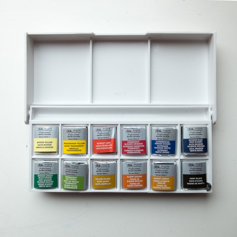
But how did I get to this? Well, because of those annoying “cool” and “warm” classifications. Having no pure primaries, many people choose to use a warm and a cool version of each primary colour on their basic watercolour palette, to be able to create every colour they want. Sounds like a plan. I also have a similar little palette now (with some extras).
But the terminology is flawed.
“Warm” and “cool” are so misleading, because most people mean different things with them. Some people would call ultramarine a warm blue, because it’s closer to red than a greenish blue (red being the most important warm colour in their eyes). Other people would call it a cool blue, because it is close to purple, which is a cool colour in their book. Phthalo blue (a greenish blue) could likewise be classified as cool (because it is far away from red) or warm (because it is closer to yellow than the rest of the blues). And if you read online forums, it is often not clear what people mean by warm or cool. Some say that warm colours “come forward” and cool colours “recede” in a picture, but I think that’s also a rather subjective way of categorizing colour.
So, for a while I was confused there. I interpreted warm blue as containing yellow, and cool blue as containing red. If I wanted to make a cool green, I would just have to combine cool blue with cool yellow, right? It does sound kind of logical.
Right? No. Wrong.
Cool blue in my case contained red, so I was using all three primaries (blue and red in the blue, and blue and yellow in the yellow) – this would not become a cool green (or a bright one), but more of an olive green. Confusion galore. Until I started thinking about the essence of the pigments I was using and their position on the colour wheel.
So, from now on, I’m going to try and avoid the biased “cool” and “warm”, and only consider a primary colour’s basis and bias. Red shade blue and green shade blue, for example. That’s probably less likely to be misunderstood than the warm/cool classification.
Colour never ceases to amaze me. This post was only about pigment tints, but nothing about their other characteristics, like granulation, opaqueness, staining, lightfastness, and intensity… I still have so much to learn!
