After my previous post about Ravelry and accessibility, more has happened, so here’s an update.
Ravelry users are still being silenced on the For the love of Ravelry forum, so they have moved to other spaces to express their frustration with the current situation, and to discuss strategies on how to approach Ravelry and get them to listen. One of these spaces is the Ravelry Accessibility Discussions group on Ravelry itself. There is also a lot of talk about this on Instagram. For instance, the designer Sarah M Goodwin has created an open letter to Ravelry that designers can cosign. This letter will be finalised tomorrow evening and will be shared with the Ravelry team after that. If you are a designer and care about accessibility, please consider signing it here.
Another Instagram user, KatieBea, who was featured as a Human of Ravelry in February this year, collected the stories of users who have experienced health concerns because of the new Ravelry design, and shared them in her stories. Note that those people were not able to use Ravelry without endangering their health again, and they could not participate in the surveys that were all in the new design. She basically validated their experiences by showing them that they were not alone, and gave them a voice that could not be as easily ignored as an e-mail to Ravelry support (the only avenue of communication still open at that point).
Katie also added a poll to her stories, asking designers whether they had seen a drop in their sales on Ravelry lately. The majority of the about 100 designers who responded answered “Yes”.
Meanwhile, Ravelry was quiet, except for the overly cheery frontpage posts by Mary Heather, that, despite people asking her not to repeatedly, kept using the new icons as bullet points. It may sound innocent enough, but not using the proper elements for creating structure confuses screen readers, making the posts much less readable for people depending on those. Another slap in the face for people with disabilities. She also included screenshots of NuRav without putting them in spoiler tags, so it was quite risky to read the front page if you were one of those affected, even if you were on Classic Ravelry.
And then this happened a week ago:
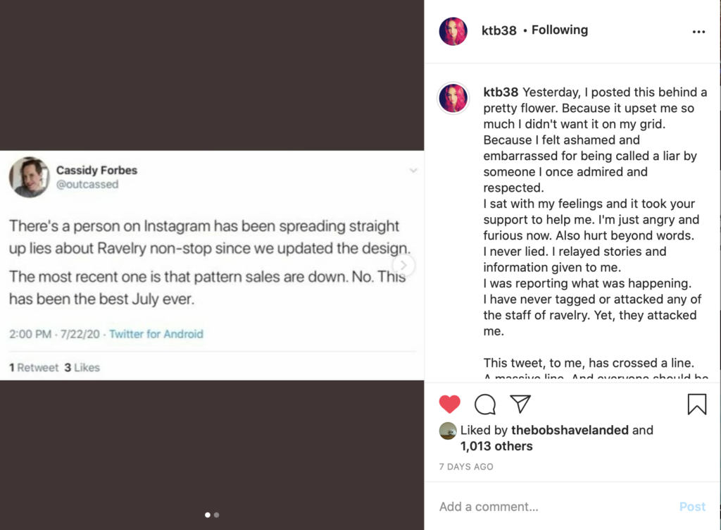
Cassidy Forbes is one of the founders of Ravelry. She deleted this tweet and her whole twitter account shortly after this, but the screenshot had already been made. It was clear who Cassidy was talking about: KatieBea. Her second sentence refers to the poll that Katie placed in her stories.
There’s a lot to unpack in this tweet. Katie has been sharing stories from people who have experienced health issues because of the Ravelry redesign. Cassidy is saying that she’s lying, and that means that Cassidy thinks that all those people who shared their stories with Katie are making it up too. Secondly, Cassidy is insisting that the sales are up this July, so that’s supposedly more proof that Katie is lying. Cassidy does not realise that sales being up on average does not mean that everybody’s sales are up. Katie got 100 replies to her casual poll, just a fraction of the designers on Ravelry (which she also stated in her stories). Katie is not lying, and she’s clear about what her poll and numbers mean.
More people started to become involved and some of them started to take real life action. Designers pulled their patterns from the site, and regular members started closing their accounts.
Things were escalating quickly and then this bomb dropped:
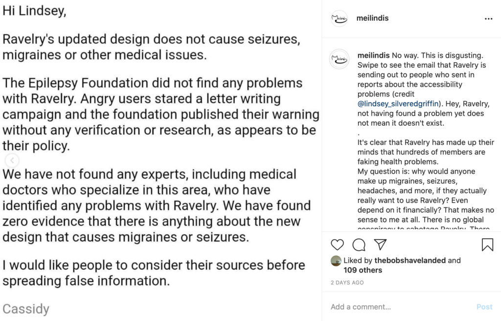
People who had sent e-mails to Ravelry Support weeks ago about the accessibility issues started receiving this form e-mail from Cassidy herself. It was clear: Ravelry did not believe the people experiencing issues at all, and their silence meant that they were waiting for the problem to just go away already.
This e-mail is a form of gaslighting (trying to convince someone else that what they are experiencing is not real). If you were not aware that there were hundreds of others experiencing the same problems as you were, would you start doubting yourself after receiving this e-mail?
And I ask you this: why would so many people who LOVE Ravelry, who visited the website daily, who depend on it for its community, for meeting their online friends, and also financially – why would they start a campaign against Ravelry? They desperately want to be there, to use it, to enjoy it. Of course they’re not imagining things, why would they?
Add to that the experience that many people (especially women) have with the medical system: if the doctor cannot immediately find a physical problem, their complaints are often discredited as being “psychosomatic” (aka you’re just imagining things), and no real help is given. This reminds me of that feeling.
The outrage after this e-mail was great. Many more people started to close their accounts, and the e-mail was being shared all over the place. This was the nail in the coffin for many who were still hoping that Ravelry would come around. They were done.
And then there was a new voice. Jessica, the other Ravelry founder, published a letter on the Ravelry frontpage and blog on behalf of the Ravelry team. It contained an apology of sorts and a lot of justifying what they had been doing in the last six weeks. I’ll try and unpack here why I think that this letter is just damage control and performative.
It started with this apology:
I first would like to apologize for any stress and uncertainty that the Ravelry site redesign has caused in what is already a difficult year. I am so sorry that our actions, or inactions, have made anyone in the community feel unheard. We acknowledge that our responses up to this point have been insufficient.
It pains the whole team and myself that Ravelry, which we know is a source of comfort to many, caused any additional anxiety to anyone at all. I hope that people will find joy on Ravelry again and please know we are working hard toward this goal.
Sounds good? At first sight, yes, this is an apology. But what are they apologising for exactly? “Stress”, “uncertainty”, “making people feel unheard”, and “anxiety”. But not for the seizures, migraines, headaches, and other health issues that Ravelry caused. So either they think that those are not real (and “just” part of people’s anxiety problems, minimising the harm done. That’s a more subtle version of gaslighting, by the way), or they don’t want to acknowledge that the site caused those symptoms (making those people feel “unheard” even more). They are also not apologising to the people who were harassed by Cassidy. Not the best start.
Jess continues with an explanation of their silence: they thought that the posts on the front page would suffice, but since the front page is not accessible to everybody, they will also publish the posts on their separate blog. Note that they do implicitly acknowledge here that the website as it is is not accessible to everybody.
She then goes on to explain that they can’t keep track of all the complaints and suggestions that come in through the forums and social media, so that’s why they only want to receive feedback via e-mail. And they will add a beta testing feature to the website. I think that making the website that they have now accessible is more important than adding new features, but hey.
Then there’s this paragraph:
With regard to tweets and emails sent by Cassidy, we would like to make clear they do not reflect the opinions and professional intentions of the Ravelry team, or the way we think about what people are experiencing. We have not been as aware as we should be that these messages were being sent. Cassidy was not in a state to be talking with people, though she does understand that this is no excuse and that the emails that she wrote were hurtful. She is ashamed and sincerely sorry. It will take a period of adjustment, but in the future Cassidy’s role will be focused on technical work. She no longer has access to the customer service emails and her Ravelry mail is disabled.
The first time that I read this I felt really icky, and now, a few days later, I’m realising why that is. They’re basically putting all the blame on Cassidy (so they’ve done nothing wrong), and then they blame Cassidy’s actions on her mental health problems (so she can’t really help it either).
In my opinion, they’re a (small) team, so how is it only Cassidy’s fault how they’ve handled this in the past six weeks, well, the past 18 months if you take into account that that is when they started working on the redesign? Yes, Cassidy has done some nasty things in the last week, and she should apologise for that, and by the way, I really wish her well, but it’s not fair to put all the blame on her. Cassidy represents the team, as does Jess in this e-mail, and they should all be accountable for how Ravelry is being run.
We hear, understand, and believe that the New site is still not working for some. In addition to the updates and customization options that we’ve already shared, we are in the process of creating more with the goal of making the new Ravelry site work well for everyone. I want to stress that the updates that Mary Heather has posted are not the only things we are working on. We have also been searching for a consultant with a specialization in visual web accessibility that we can work with on an ongoing basis, as the people we have spoken with so far were only available temporarily. We are continuing to research, and this is a priority for us.
The site is not “not working” for some. That implies that there’s just a technical problem, like an incompatibility with a certain browser or something like that. The site is actively harming some, meaning that they can’t risk to use it unless they want to take the chance that they will experience another seizure or migraine. Calling that “not working” is really minimising the problem.
If you cannot use the new design right now, Classic Ravelry is still available to you, and you can switch your account to the Classic site through a toggle in your Profile drop-down menu. We have made no changes to Classic Ravelry (which you can verify by comparing the CSS files as they appeared on June 15: part 1 and part 2), and will not be adding new features or making changes to it, so it will remain the familiar site that you are used to.
Interesting how they think that someone who cannot use Ravelry right now is somehow magically able to use it anyway to access that menu. Disability is not a preference.
By the way, having the same css says nothing. There are many technologies that websites use, and css is only about how the underlying content is presented (formatting, spacing). If you change the way that your website loads (for example, pre-loading all the images or not) or if you add animations, those can cause issues. If these technologies are shared between Classic and NuRav, it is possible to encounter NuRav problems in Classic.
Hiring an accessibility expert is a priority, but they’re still not reverting back to Classic Ravelry as the default in the mean time. Why?
Naturally, some people have wondered why we didn’t roll back to using the Classic site as the default, and of course we seriously considered this option.
Over the years, we had heard from many people who had trouble using the Classic version of Ravelry. Since June, many reactions that we have received about the redesign have let us know that the new design is much more usable for many of these Ravelers, including a large number of people with disabilities and folks with vision issues.
For example: we know that the new mobile site—which is many people’s only way to access Ravelry—is proving to be much more accessible to many Ravelers with disabilities. We are also finding that specific elements of the new design that some folks say affect them negatively are, to others, improvements compared to the old site.
After taking in the breadth of initial feedback, we came to the conclusion that switching back to Classic Ravelry would not serve the greatest number of Ravelers. It was not an easy decision to make, as we want the site to be the best it can be for everyone, but we feel confident that keeping the new design of Ravelry, with the customization options we now have available at ravelry.com/preferences (and more coming with accessibility forefront in our minds!) is the best solution for the most people.
This is the first that I’ve heard about problems using the old version of the website. I wonder what those problems were. Jess does not elaborate, except to say that the mobile site is more accessible. But what does that mean? What does she mean when she says ‘accessible’? Because there is no such thing as more accessible. It’s either accessible or it isn’t. When reading this, I get the impression that she’s talking about usability instead, which is not the same thing as making something accessible. She uses the words interchangeably (in the first paragraph she mentions ‘usable’ and after that it’s ‘accessible’).
This answer creates even more questions. If Classic Ravelry was already not accessible, and they were aware of that, why was accessibility not front and centre when creating and implementing the redesign? Why was there no proper accessibility testing before the website went live? Why are the very real accessibility problems still being ignored and downplayed in Ravelry’s actions?
And the shocking conclusion to the last paragraph is that they can roll back the site to Classic, but they choose not to. They claim to be inclusive, but they actively exclude the people who cannot use NuRav because of visual or neurological disabilities. They choose to go with numbers here, but not from an accessibility perspective if I read it correctly. It’s just the version that most Ravelers prefer. Disability is not a preference.
Their proposed solution (putting accessibility options in a Preferences menu) is laughable. That’s like telling someone in a wheelchair that the wheelchair ramp is over there, down those stairs. They can’t get to it. Which is why we’re all asking for Classic to become the default (assuming the people who had problems with Classic Ravelry are able to access those menus).
Jessica then explains why they don’t hire more people. Money is tight. Of course that is reasonable. But I think that if there were a small, optional fee to use Ravelry (similar to the photos subscription), many people would gladly pay some money for this awesome website, and those who can’t won’t have to. But that’s something to tackle after solving the accessibility issues.
We are working on more customizations based on survey results and the input we’ve received. We are confident that the forthcoming updates based on this data will be truly helpful to people who are having issues with high contrast aspects of the site design. Also, the new behind-the-scenes design system will allow for increased modern accessibility as we redo areas of the site and build new features. We will continue to consult outside accessibility experts as well.
This is what they are going to do. Remember those surveys? One of them was tied to your Ravelry account (against GDPR regulations) and was only about readability and whether you like the icons, the other one was 30+ pages full of screenshots of NuRav (so not accessible to those who have problems with the site)? If they base their actions on the results of those flawed, biased surveys, they won’t solve the accessibility problems.
Additionally, I don’t trust them to fix things without the help of a true accessibility expert. Right now, they’re not even sure what accessibility means, the person coding doesn’t believe that Ravelry has an accessibility problem, and they’re keeping up the new version of the website despite knowing that it has caused seizures, migraines, and other health issues. How can I trust them to know what to fix, or not to make it worse? Right now, I can’t.
Meanwhile, it’s still Verboten to talk about this stuff on For the love of Ravelry. Ravelry’s social media are still closed for comments. NuRav is still the default. Nothing has changed.
While I’m glad to see that they’re finally coming out to talk, nothing has changed yet.
These are the things that need to be done before I will consider putting my patterns back up and giving them another chance:
- Apologise to all people who have had their health affected by the website.
- Revert to Classic Ravelry until the website has been fixed.
- Hire an accessibility expert to make sure that the website is safe to use for all.
Nothing on my list has been done yet. While the letter from Jess may be pretty and while we all want it to be more than it is, only time and actions will tell if they really want to make these changes, and if they really are hearing us.
While I probably sound very negative in this blog post, I really do want them to succeed. I have really enjoyed using Ravelry over the past 10+ years, and I have made some good friends there. Of course I want this to be solved! That’s why I put in all this energy. If it meant nothing to me, I would just close my account and walk away.
Update: Some things have happened in the last few days that put this post in a slightly different perspective. While my opinion on the letter from Jess and the current inaccessibility of Ravelry still stand, my opinion on what has happened around KatieBea has changed.
I did miss this when it was happening because it was spread over multiple Social Media platforms, but apparently Katie retweeted alt-right content on Twitter, was corrected by a BiPOC, and showed white fragility by tone policing her, making excuses, playing the victim, comparing the accessibility discussion to Black Lives Matter, and then doing some dirty deletes under the guise of taking care of her mental health. Apparently, the people ‘harassing’ here were actually at least partially BiPOC calling her out.
I do not condone that kind of behaviour and I’m sincerely sorry that I have amplified her voice both here and on Instagram. I do hope that she chooses to learn from this experience, and I have learned a valuable lesson too: be more aware of the voices that I amplify and keep my eye on the goal (accessibility) instead of an individual.
Update 2: Meanwhile, the designers’ open letter has been sent to Ravelry, and it got a short reply.
Thank you for writing with your concerns and care. I shared your letter with Jessica and we discussed it this morning. We hope that Jessicas letter last week addressed these concerns and helped share our thoughts behind our decisions and our next steps. We will be following up with continued updates on our blog and look forward to continuing this work.
Best regards, Mary Heather (and Jessica)
Four lines in response to 400 designers pouring their hearts out about the new Ravelry design. No empathy or compassion for their experiences whatsoever. A reference to Jessica’s blog post that was so sadly lacking. If that blog post would have answered those questions, we would not have sent the letter.
At this point, I’m sure that Ravelry has no intention to acknowledge the hurt they are causing with the redesign. I’m going to look for a new place to share my designs, and I’m going to try and create an offline knitting/spinning notebook application that can read my downloaded Ravelry data. After that, my profile there will be empty.

Thanks fo taking the time and energy to elaborate upon this. I’m still not sure how to handle it all and saw the post from Jessica as a acknowledgement for the serious problems the site has caused, and for the way Ravelry has dealt with that fact, but your post gives me a lot to think about. I do still hope it’s a start of fixing what’s been broken recently..
Yes, so do I. I really want to see them fix it and for us all to heal from this. On the other hand, I find that I need to accept the reality. It can still go either way, let’s hope that this was indeed a good first step in the right direction. Hugs to you!
I was already turning away from Ravelry, it was no longer my home because of the way they handled things. Their attitude felt so new and cold and weird. And unprofessional! I could not understand. Why overlook the whole field of user experience? And if you do and users point it out, why dig in your heels? I knew Ravelry to always want to learn and communicate. I was turning away and feeling lonely.
Jess’ letter made me backtrack, because it does sound like the Ravelry of old we knew: the small team that’s close to the users and the feeling that we make the site together, all of us. Still we’ll have to see. There’s a rift in the team, it seems, and they’ve publicly shown it and that means it’s very deep.
What a wake up call for us, to find how much we rely on the site, to keep score of projects and to feel connected to other people. I feel vulnerable now, knowing this. A poorly timed realization on top of pandemic social despair and the USA shitshow poisoning the world’s future and living conditions.
(Also the new site causes my eyes to hurt and it angers me that I cannot escape it. The survey was in the new format. As are messages from Rav about patterns you purchase. Also when you log out the log in screen is new rav.)
Like Hilde-Lotte I want to thank you for documenting this and giving us context.
Yes, me too. I was just sort of sticking around to see if they would reflect and do a course correction, but it has been almost two months. They won’t change. I’m not participating anymore at the moment. My account is basically sleeping.
Did you check out the new initiatives that have been started yet? Fiber Club seems promising.
On the other hand I feel a bit done with having to rely on online services to keep my project data safe, so I’m thinking about building a basic offline project managing application myself… Something customisable that can import and edit the Ravelry export data. Still got a lot of research to do for that, though. But hey, could be fun!
You are right that it is quite a deep feeling of being vulnerable/unsafe when things like this happen. Especially during a pandemic… two of these at the same time!
I have eye strain too because of the new site. I have hardly used it since I noticed, because I know that I am prone to migraines, and I didn’t want to test if that would happen if I stayed. Classic seems better, fortunately, but it’s not going to stay around forever.
You know, I think that Ravelry is underestimating the effect of this problem. I think that the people who experience the problems the most are people who use the site more intensively, for example, to browse patterns, or to actively take part in the forums. Those are also the people who provide the most content. Losing that type of people is not good for Ravelry at all. Ravelry depends on the community. Ravelry is not the community. They seem to be forgetting that.
It’s not true that “classic Ravelry” (ugh, hate that term) hasn’t been changed. Some search functions don’t work any more and the “editing” tab is no longer available for some patterns. (There may be more problems but these are the two I have noticed.) I can no longer fully participate as a volunteer editor, which makes me sad.
I also feel like they did not consider neurodiversity. Many people find non-functional change difficult to cope with (or understand), like changing colours or fonts, rather than improving searches.
I came here via Google, looking for an alternative to Rav. When they take down “Classic” I will not be able to use the site because the new fonts give me eyestrain and headaches. Even with the Herdwick.
I’m not a designer; I have just been enjoying the site and putting my pattern/project notes there for years because it is convenient and easy to use.
I have vision issues. This won’t change and as I get older it is likely to worsen. I really need a site I can read.
So, is anyone working on making an alternative to Ravelry that is readable for folks with vision issues? I don’t care about politics, the tint of a logo, etc. Just want to be able to read it without headaches.
Thank you all!
As far as I know, there are a few sites being worked on, but none of them seems to completely replace Rav. Ravelry is quite unique in its combination of the vast pattern/yarn database, user projects, forums, and possibility to buy patterns. From what I’ve seen, other projects focus mostly on being a pattern supplier (Ribblr comes to mind, as well as Fiber Club). The social aspect is moving towards other social media like Facebook, Reddit, Discord, etc. Ravelry unfortunately still has a monopoly, but I do have hope that that will be changed soon. Especially now that they are going to take down Classic in March 2021. Another group of users will be looking for an alternative by then.
Something you could also look into: install the Stylish plugin and use the skin that was made by Evanita Montalvo (see here: https://www.ravelry.com/projects/EWM/ravelry-stylish-updatecheck-project-page-for-updates – warning: it’s a Ravelry project page that may open in their new style). She’s trying to approach Classic as much as possible with her website skin, and it could help you use Ravelry while you don’t have an alternative yet.
Thanks for the explanations because I am very late discovering most of this. I have lots of visual, neurological and mobility issues and I had lots of issues with NuRav. It didn’t trigger epilepsy but I was finding I just couldn’t read parts of ravelry at all and some things were jumping around my visual field, like the thick black lines and drop shadows were moving and overlaying stuff. Yes I normally have problems on all sites as I get double vision, faded colours,split vision (and even octuple vision) but on a well laid out site stuff is where you expect it and the overlaid images don’t obscure. Vision is subjective. Nobody can see through my eyes, nor gain proof it’s happening. The icons on new Rav just look like blobs and I’m in fear of clicking on the rong things. I did post,then email about it but didn’t expect a reply I just toggled to classic and mourned the days back in 2008 when Raelry was small, friendly and saw any feedback as a positive they could act on. Were they like that? I thought so. They helped me when I experienced a bit of bullying from a fellow designer, and they really seemed to champion the individual.
I think Ravelry is possibly outgrowing the founders’ grasp on it and its become a monster. Sort of like Aaron Scwartz when he sold Reddit then became disillusioned and walked away. The desire to hold on to it and keep a small friendlyteam means they’re just reacting rather than being proactive. I honestly feel like they found a cool designer, they came up with a new look that worked in a mon dynamic way, but usability/accessibility wasn’t really taken into account in early stages. Anyway, I think I left a post on a forum about my visual experience, I can’t find it now. I did dm/email about it, mistskenly thinking my input as a visually impaired previously heavy user and designer would be useful. I never heard back. I actually stopped using Ravelry but dipped in and out on Classic and went back to see if they were going to fix the things I can’t see well now. It felt like a death to me as I freaking loved Ravelry and its ethos a while back. I felt really alone over the past year thinking I’m the only one with problems with NuRav and not having Ravelry was another freedom taken from me as a disabled, housebound and immobile person. I feel vindicated that there was something wrong for others too. I’m not sure what’s changed though, because now classic is gone the themes they offer to toggle on/off still aren’t good if you have cataracts or faxed cloudy looks to colours. For a ample one page had dark blue background, with midblue writing on…. Still couldn’t read it. The cyan or teal shades, drop shadows, weird multicoloured outlines to posts, a tow of icons that are just wavy edged blobs… It’s still a nightmare for me, but did they fix others’ more setious issues? After going all out for inclusivity, banning patterns or amplifying concerns over people who do stuff because they want to without considering the impact, it really ferls like they said “But this Ui is so pretty, why can’t we just have this? We’ve made it now, so it’s too late to cancel. But my friends say it’s OK, nobody else disabled has a problem with it! ” and these are the kind of statements had they been about doing things that have an impact on people of different races, religion, politics, sexuality or gender, size etc they’d totally be unacceptable and Rsvelry are the first to cancel things like that. But gaslighting disabled e people? Pulling out vague statements of people who said it was OK? Implying that my visual problems shouldn’t officially be happening? Nope… I’m not having that. I can’t help what my eyes do. This isn’t a comment on my plus size body that I have which I could choose to ignore but still do what I need to on the site. This is about a thing I can’t ignore, my weird and unique vision. And it’s easy to fix. Ditch the new design,change it back to Classic Ravelry, then start over with an accessibility expert that covers all areas off disability, get a wide volunteer user group for specific testing on various devices with results collated back to a usability team with accessibility staff included. And if it’s all to expensive, then maybe don’t charge me 2% if my income each year, don’t charge for ads if they can’t reach disabled knitters too. I’d like to close my Ravelry store but that would mean losing sales and 100‰ of my pattern income goes to charity. And still after 15 yrs there’s no serious rival to Ravelry. And I’m too sick to work and moving my patterns would be work. So I do ferl icky but I’m stuck in the platform.
This whole situation makes me sick – it feels a bit parallel to how I feel about purchasing stuff on Amazon. It’s widely known know that Amazon is an exploitive, abusive company – but it’s also the primary platform that many companies rely on to get their items sold, and Amazon sales numbers matter greatly to their success. So while I’ve had periods where I felt too gross to purchase from them (and I will still try to order directly from companies if they get more profit that way), I’m also not sure boycotting Amazon will actually help those who rely on Amazon for their sales. I get the impression the same is true to some extent about designs sold on Ravelry – there’s currently no other platform and community like it, and for that reason I’m not ready to leave even though I absolutely don’t want to endorse the founders’ ableism and dismissive posture towards those being harmed by them. I have noticed that many designers are being very intentional about emphasizing alternative ways to access their patterns outside of Ravelry, which I think is really good, but it’s still not fair that those users aren’t able to experience the benefits others can on Ravelry. My hope is that Ravelry is eventually taken over by a more inclusive and respectful team that takes its users’ experiences seriously.